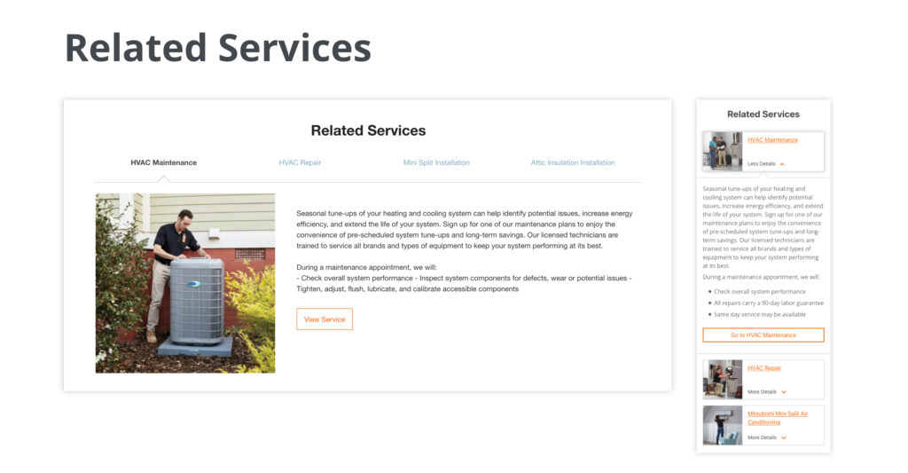
HD National Page Template Design
Product Designer
Project Goals
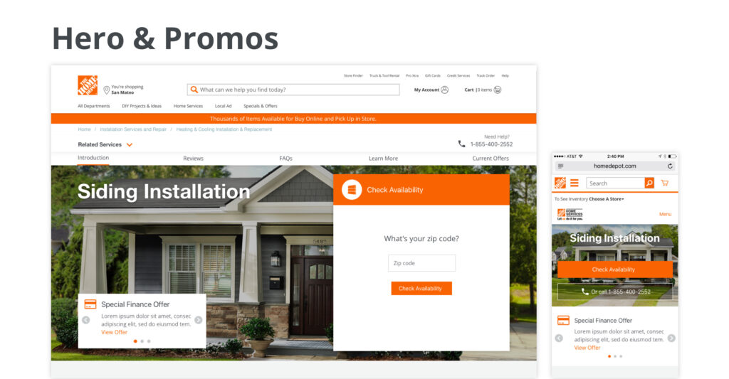
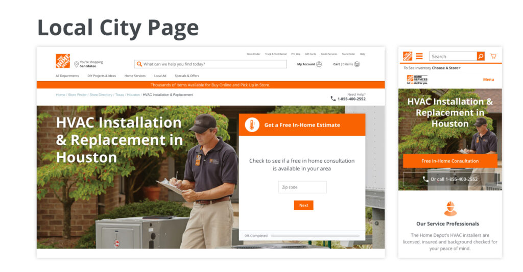
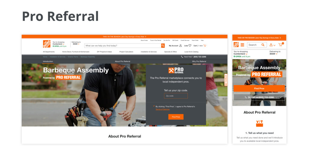
- Redesign the HVAC National Page. The design must work for all programs 100+ Home Service programs as well as Pro Referral.
- Create educational content for customers researching.
- Identify opportunities that grow the business and increase conversion.
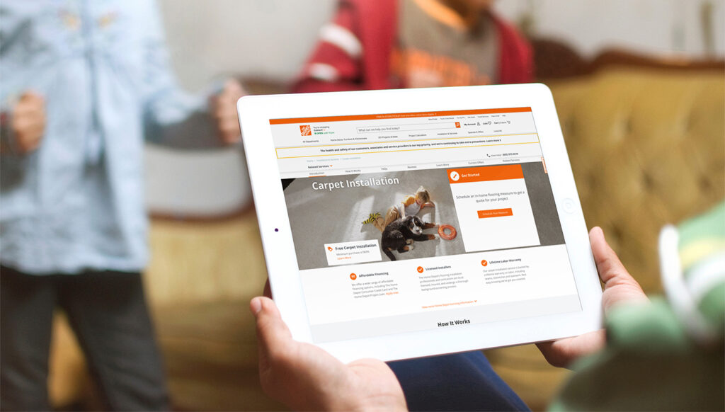
Featured: The Home Depot TV Commercial, ‘Free Carpet Installation: $699’
Cross-functional teammates include: Sr. Product Manager: Bill Rainusso, Engineering Manager: Leo Korman, Front-End Engineers: Alex Simonides and Hamzeh Doostie, Backend Engineer: Muhtarcan Goktas, Software QA: Svetlana Girzhman, Data Engineer: Maria D’Souza, User-Research: Jerry Sinocruz.
Process:
Discovery & Framing
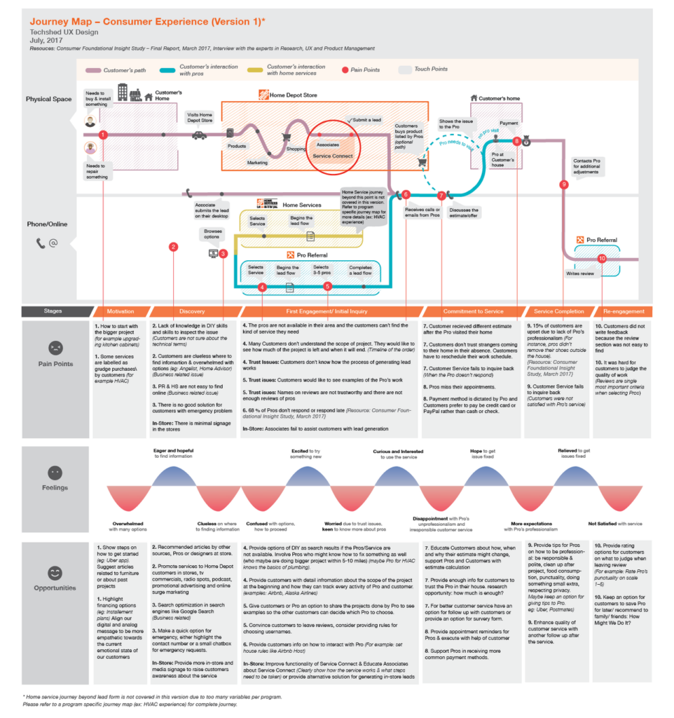
Research & Journey Mapping
I worked with our Lead User Researcher to understand the homeowners’ end-to-end processes and mindsets by conducting 1-on-1 interviews with homeowners, store associates and pros. We discovered their motivations, wants, needs and pain points in relation to their home service journey. We did this in order to empathize with our primary (homeowners) and secondary (home service professionals) audiences. Then I synthesized the learnings and defined the primary and subsidiary problems. I created a problem statement that illustrated its impact and effect on users.
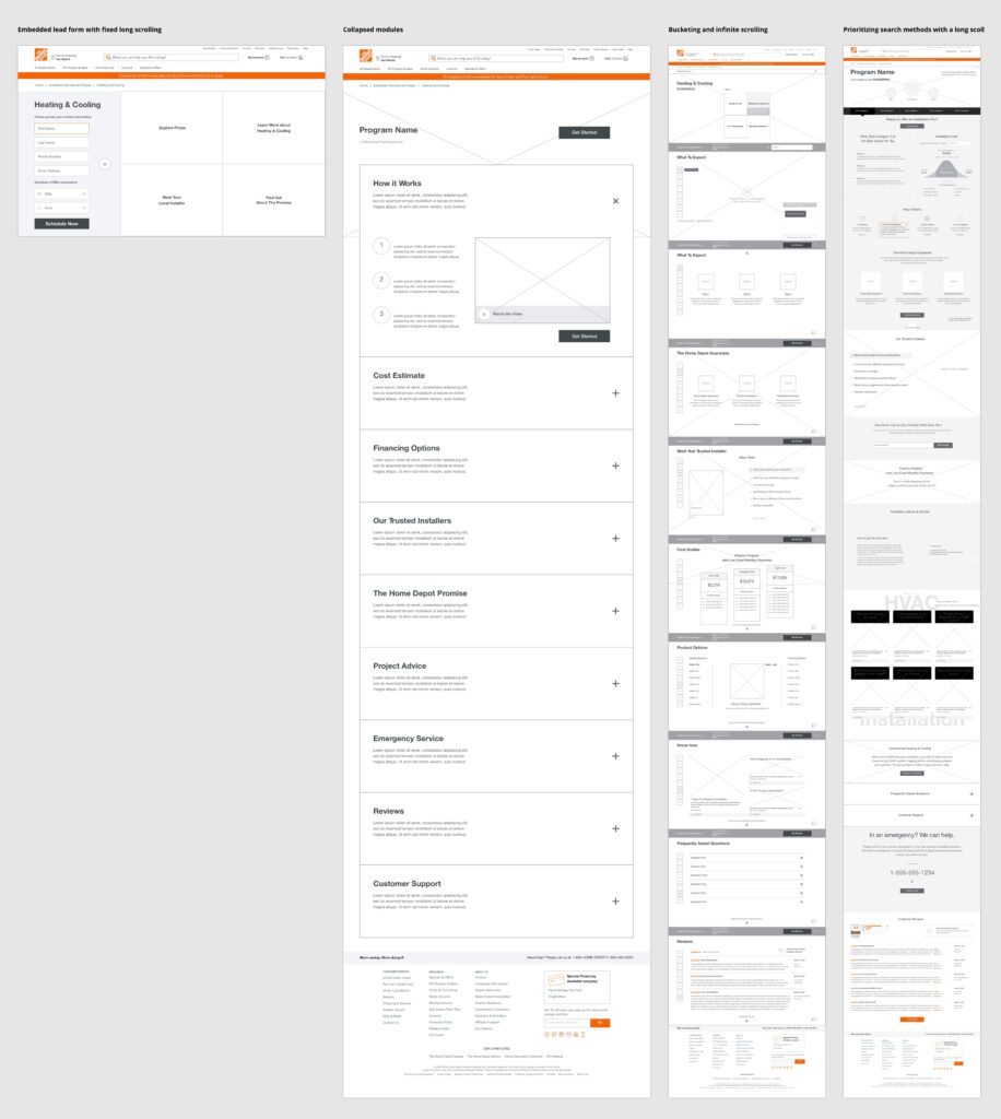
Wireframes
Then came the ideation process, I sketched many solutions to the outlined problem without going too deep in any specific direction. Captured the essential idea and moved on. I took my strongest ideas and created several clean, digital wireframes and presented them to my Product Team to discuss and further ideate in a working session. My Product Manager, Engineering and User Research were in attendance.
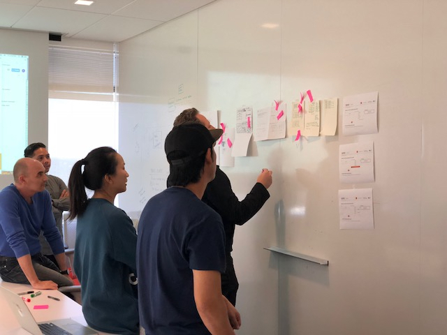
Design Sprint Workshop
I presented the Product Team’s project goals and assumptions to my UX Team. I printed out the revised wireframe designs, taped them on a whiteboard in a meeting room and walked them through the ideas. I asked them to add Post-It Notes with suggestions and critiques. We debated the feedback and developed four strong design concepts.
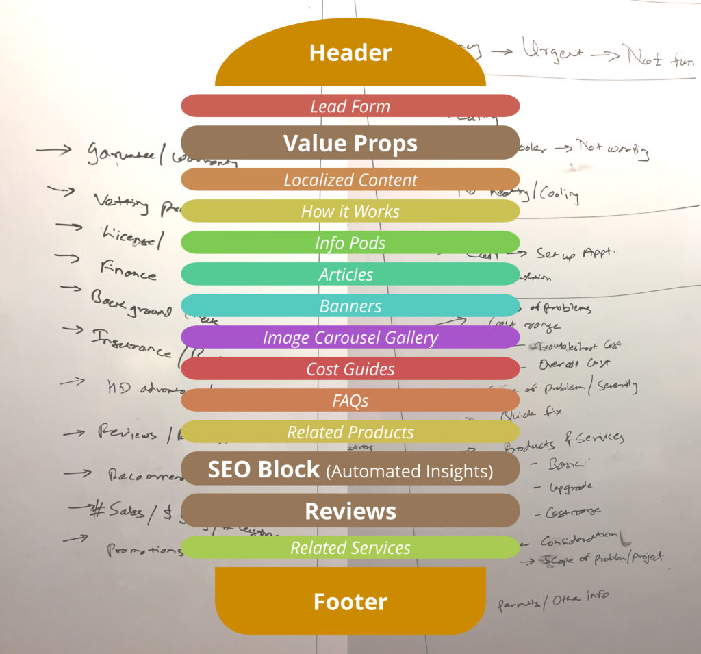
Iteration with Product Manager
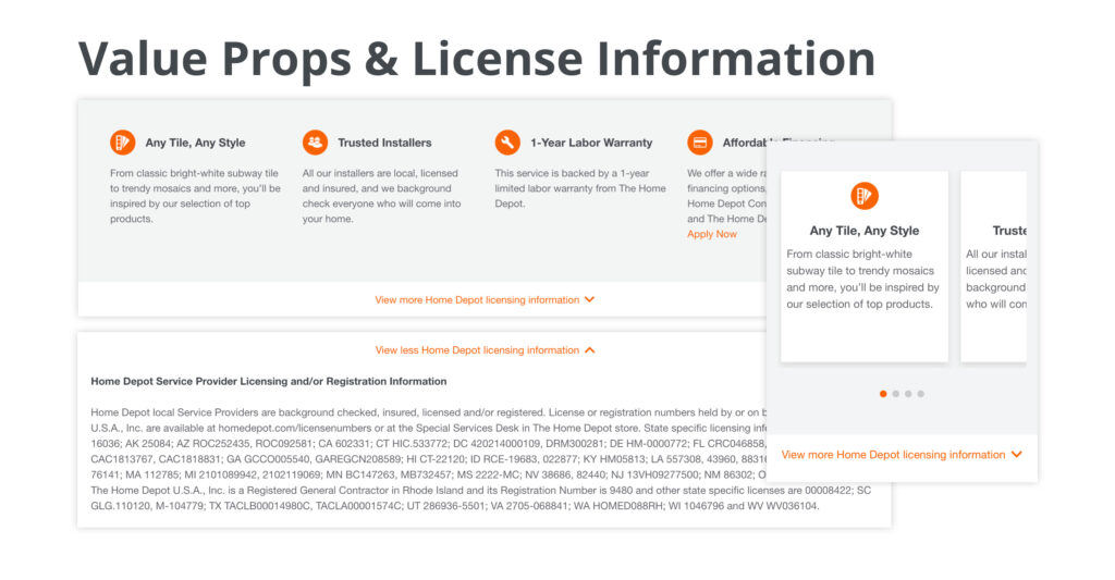
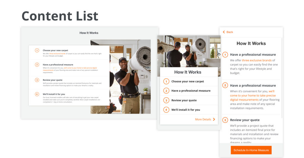
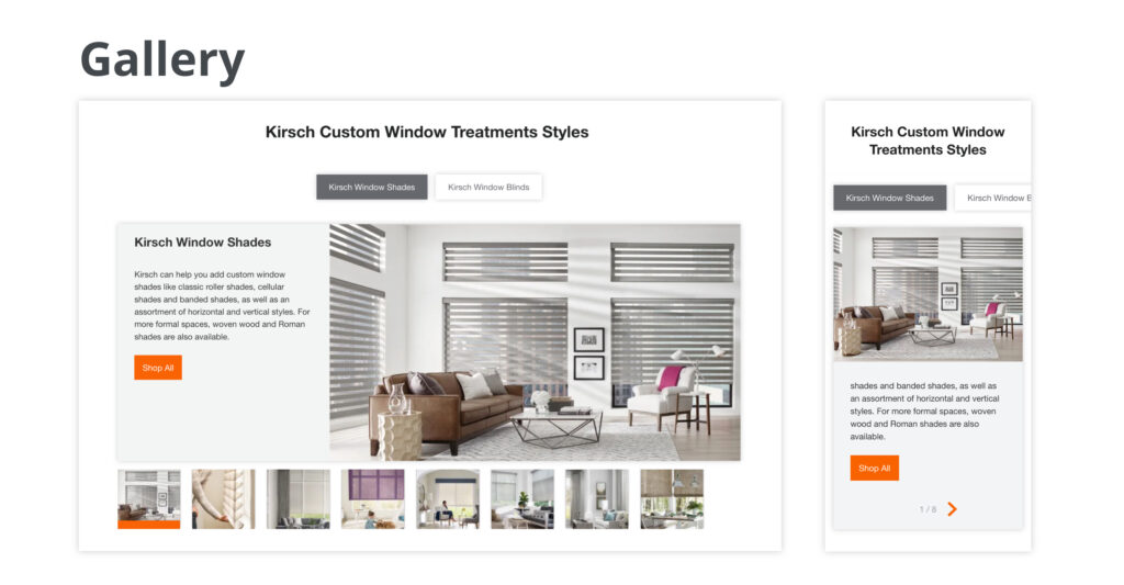
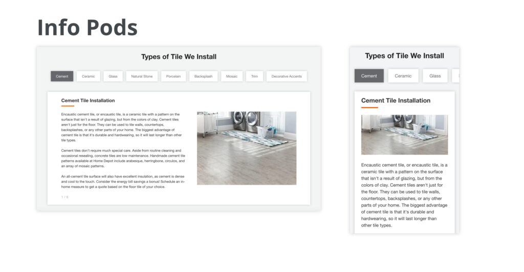
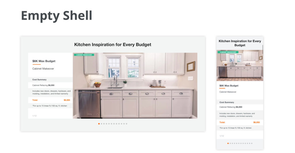
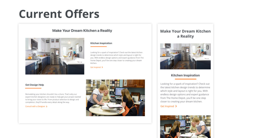
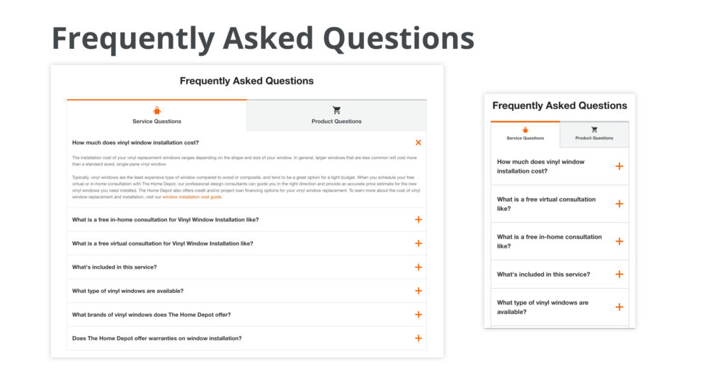
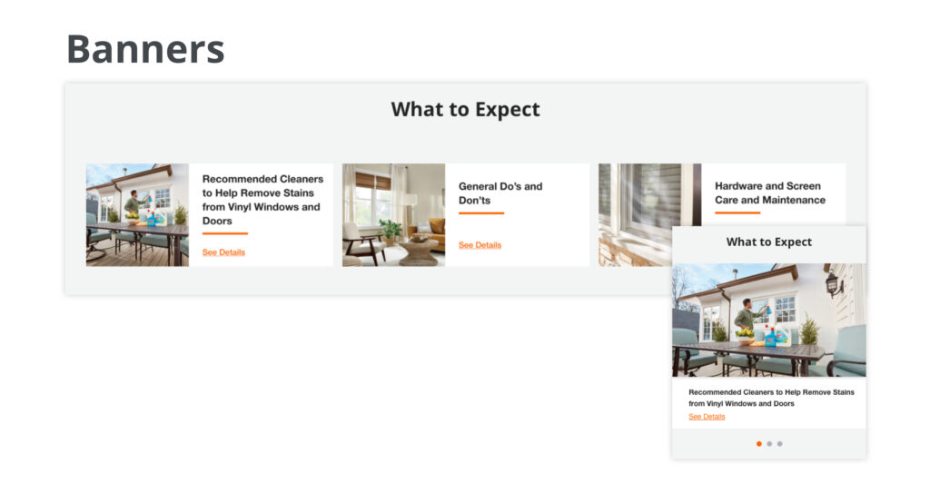
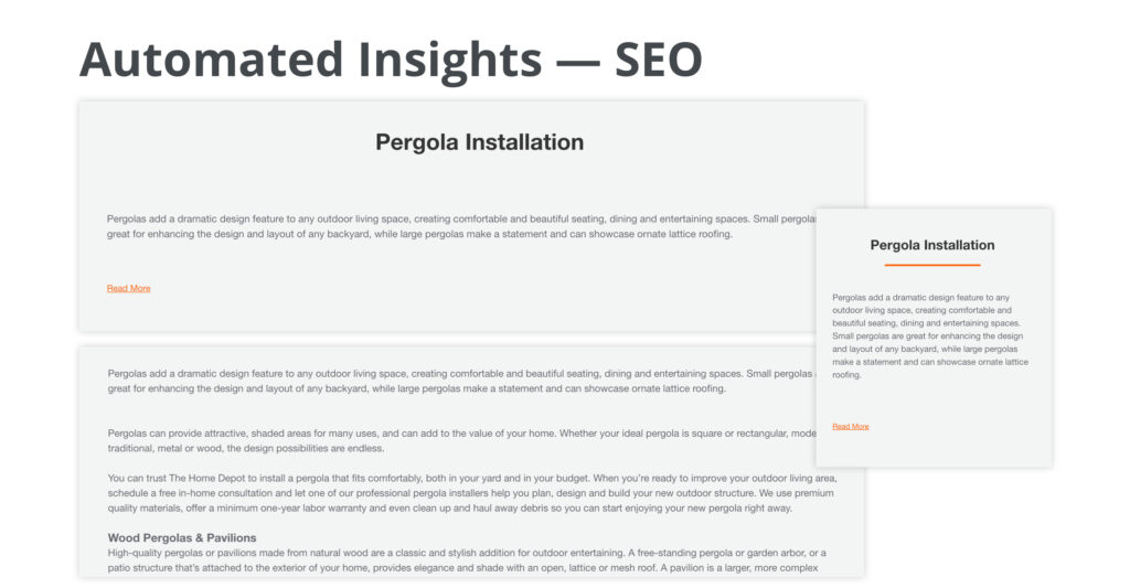
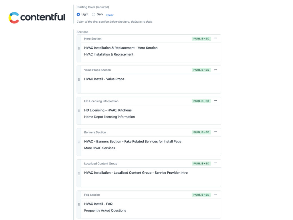
I shared the outcome of the design sprint workshop with my Product Manager. We talked through how each idea would work for all 100+ programs. We define how some programs are similar and different (grudge purchases vs. yearning purchases), what modules are needed for those programs and what’s the smartest way to build this new structure. We realized a problem is one fixed template will not universally work for every program. We needed a modular framework, which was soon lovely coined “the hamburger” by stakeholder😂. All programs need to have the buns (header and footer) and meat (value props, SEO block and reviews). Other than that, all ingredients can be chosen based on the program’s content needs.
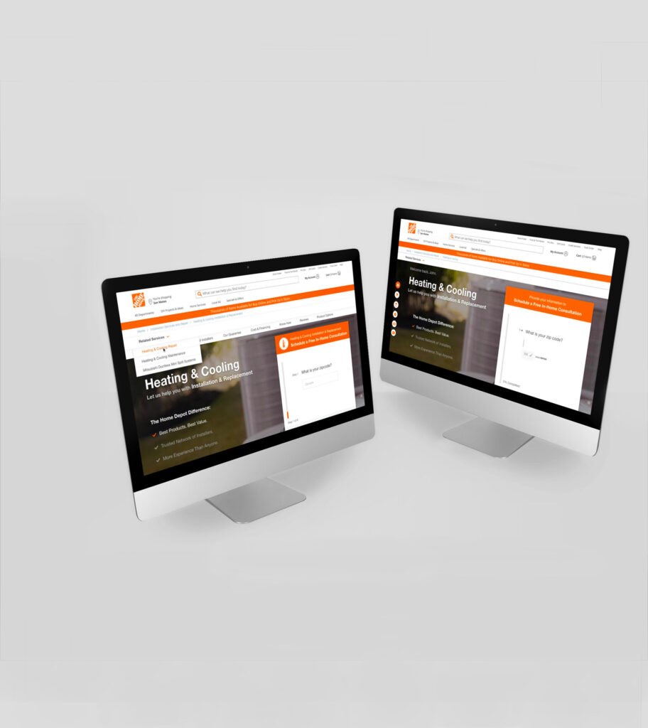
User Testing
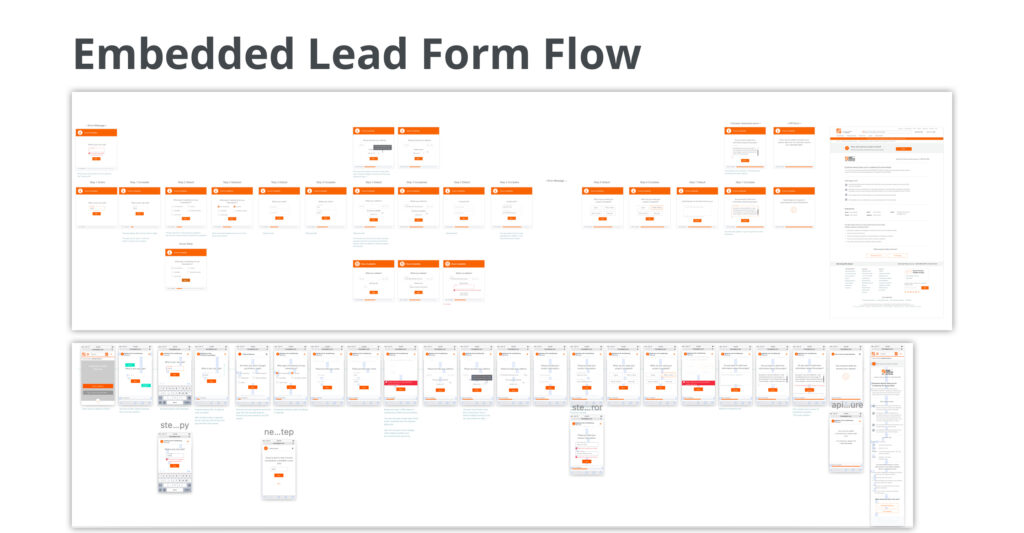
We came up with 4 creative concepts: Embedded Lead Form with an Infinite Scroll, Prioritized Search Methods with a Long Scroll, Collapsed Modules and Bucketing. We found four websites that had the main features we were curious about and launched a qualitative user test to obtain feedback from our target audience. These results enabled us to drill down to two well received designs. We learned that the embedded lead form that asked one question at a time (similar to Type Form) felt delightful. We had to decide between an Infinite or Long Scroll page. Since we were testing perception of the vertically scroll, I solicited the help of an engineer to create 2 interactive prototypes to A/B test. The tests were remote Unmoderated Sessions on UserTesting.com. We sourced 16 homeowners (40-65 years old) who were currently in the market to have a HVAC repair or installation. They were given a scenario and asked to talk through their thought process. Lastly, they were given a survey to compare and contrast. We discovered that the standard long scrolling page was prefered.
Stakeholder Signoff
I took the winning design (Embedded Lead Form with a Long Scroll), iterated incorporating user feedback. Then I presented the research and winning design to stakeholders. I received more feedback and iterated one final time.
Design Handoff
I handed off the final designs to front-end engineering via Zeplin. Building this new modular design meant replatforming our program pages, migrating from Django to Contentful, which was a huge level of effort that took extensive engineering and design QA.
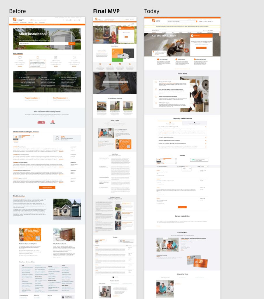
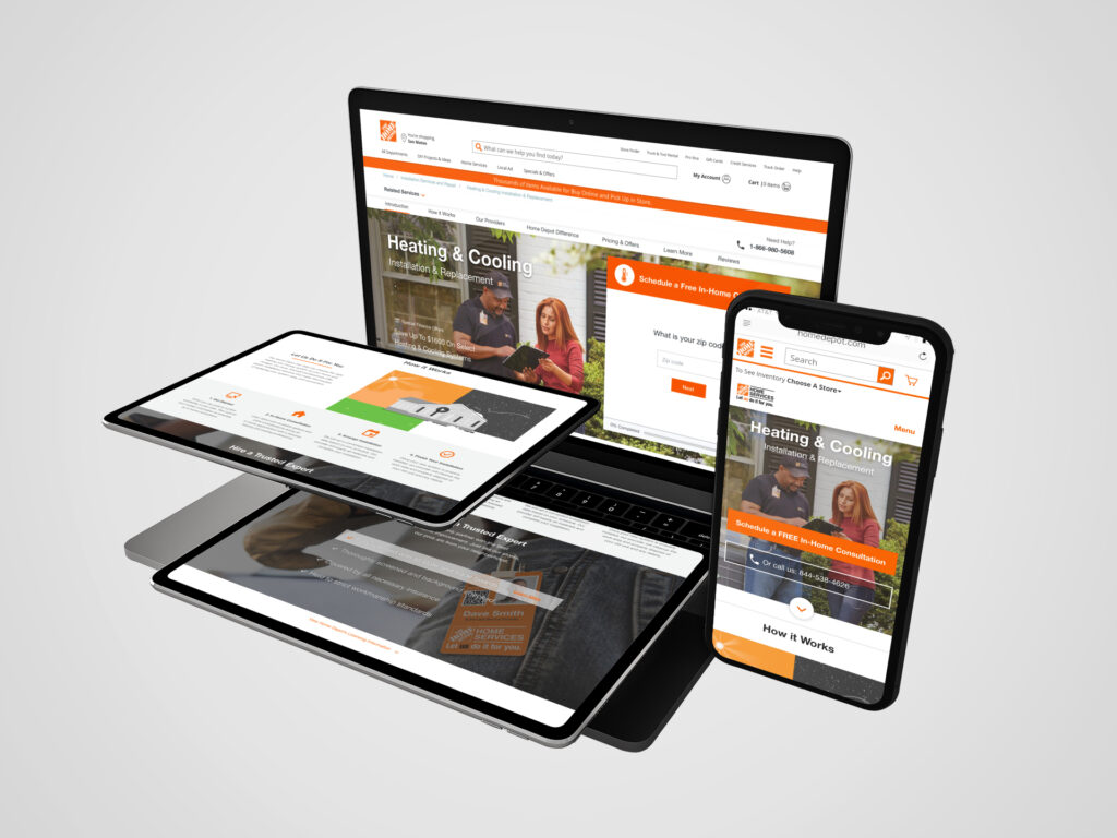
Before | Final MVP | Today
We launched our final design as an MVP and A/B tested the new design against production. Our new design received more visits to leads and ultimately more leads to sales conversion. We achieved this success by creating more qualified leads (through the embedded lead form), an intuitive UX, valuable bespoke content and an aesthetically pleasing design. After the launch, The Home Depot/Home Services’ online sales were the highest in company history.✨

