HD Homepage
MVP
Product Designer
Project Goals:
- Create the best UX for our target audience by enabling our users to find their desired service easily and intuitively.
- Better alignment with brand guidelines to ensure users feel the same trust online with Home Service as they do buying products in The Home Depot stores.
- Design a fresh look and feel to keep up with the latest design trends and best practices.
Cross-functional teammates include: Sr. Product Manager: Bill Rainusso, Engineering Manager: Leo Korman, Front-End Engineers: Alex Simonides and Hamzeh Doostie, Backend Engineer: Muhtarcan Goktas, Software QA: Svetlana Girzhman, Data Engineer: Maria D’Souza, User-Research: Jerry Sinocruz.

Target Audience
This is Tom and Linda. They have 2 kids, Sara and Will, and a dog, Oscar. Tom is a Fire Chief and Linda is a nurse. There is nothing more important to them than spending time together.
- Tom’s 48 and Linda’s 45
- Homeowners — Lubbock, TX
- Combined income of 170k
- Want an updated looking home
- Prioritizes enjoying life and willing to pay for a home improvement service
User Scenario
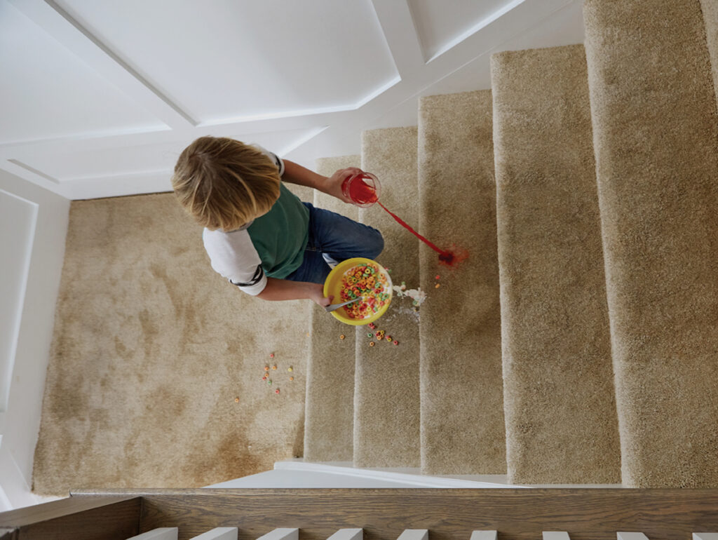
Kids and pets can be hard on a home and Tom and Linda’s carpets are worn out. They’re excited to have a clean looking aesthetic and can’t wait to have their carpet replaced. They’re feeling overwhelmed and confused as to where to begin and who to trust.
- Linda sees our commercial
- She’s reminded that a friend has used The Home Depot in the past
- Grabs her phone and types ‘Home Depot’ into the browser
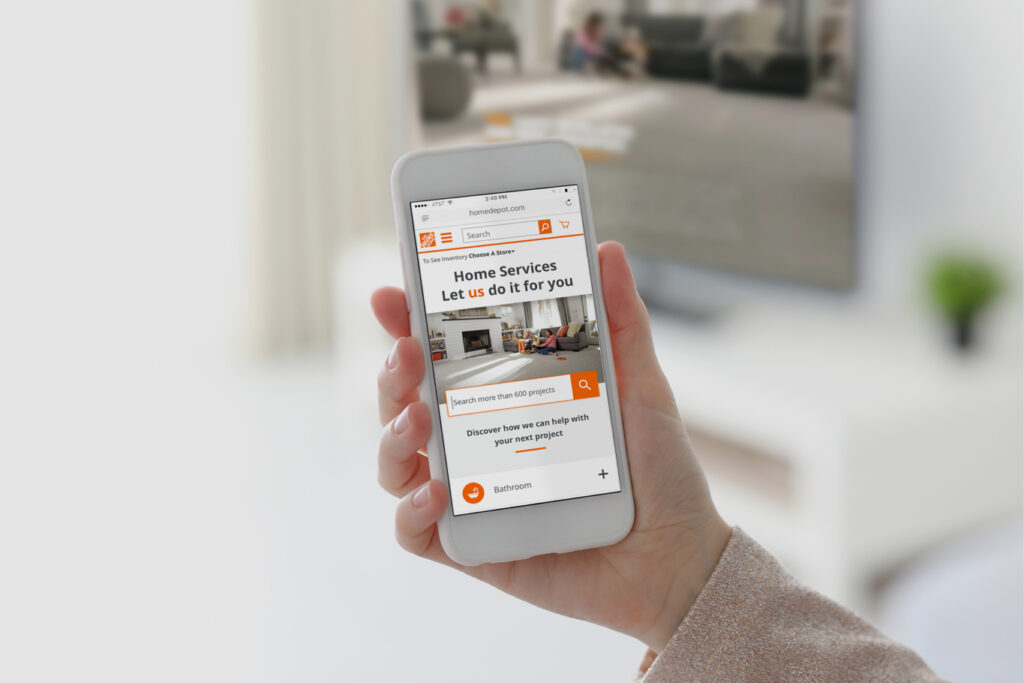
- Lands on HD.com and finds ‘Installation Services’
- Types ‘Carpet’ into the search bar
- Finds her way to the ‘Carpet Installation’ page
Analyze Crazy Egg Data – Where are users coming from?
To discover where our users were coming from, we analyzed Crazy Egg data. It was important to get a clear picture of who our users are and how they navigate.
Here’s what we learned:
1. Direct
2. HomeDepot.com
3. Google
4. Home Depot Customer Service
5. Home Depot Saving Center
6. Home Depot My Cart
7. Home Depot Professional Contractor
8. Home Services Kitchen Remodel
9. Facebook
10. Home Services Bathroom Remodel
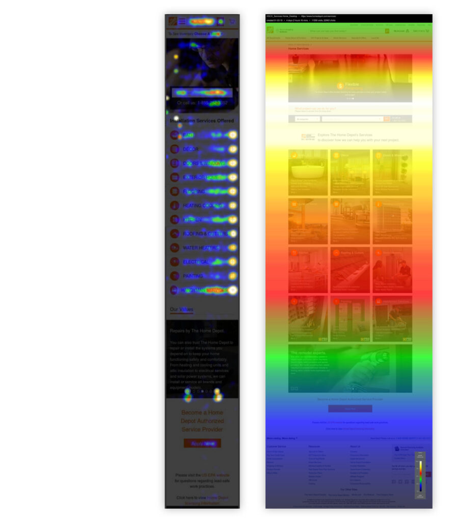
Analyze Heat Map Data – How are users interacting with our page?
To discover how users were interacting with our page, we analyzed the Crazy Egg heat map. It was important to know how far down the page users were scrolling and what content pieces were valuable. That helped us determine how long our new page should be and what content to include.
Here’s what we learned:
- Mobile: Users were interacting with both the search and browse experiences, but more so with the browse. Therefore, our hypothesis to create a high performing page was to enhance both the search and browse experiences and condense the content.
- Desktop: Significantly more users preferred to search over browse and they weren’t making it down to the bottom of the page. Therefore, our hypothesis was to emphasize an enhanced search experience, include a condensed browse experience and tighten up the page.
Competitor Feature Analysis
We analyzed 12 competitors’ homepages to capture features related to content and design.
Here’s the content pieces we were looking at:
- Hero Image
- Hero Carousel
- Hero Mood
- Hero Copy
- Phone Number
- Search CTA Copy
- How It Works
- Browse In Page
- Browse Categories
- Videos
- Testimonials
- Cost Guides
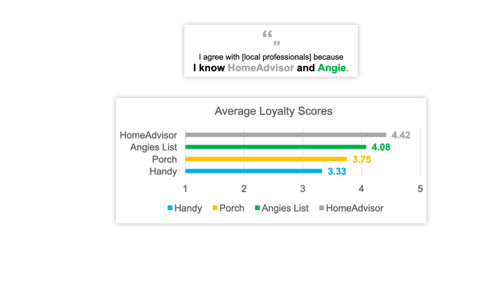
Homepage Competitor Benchmark Study
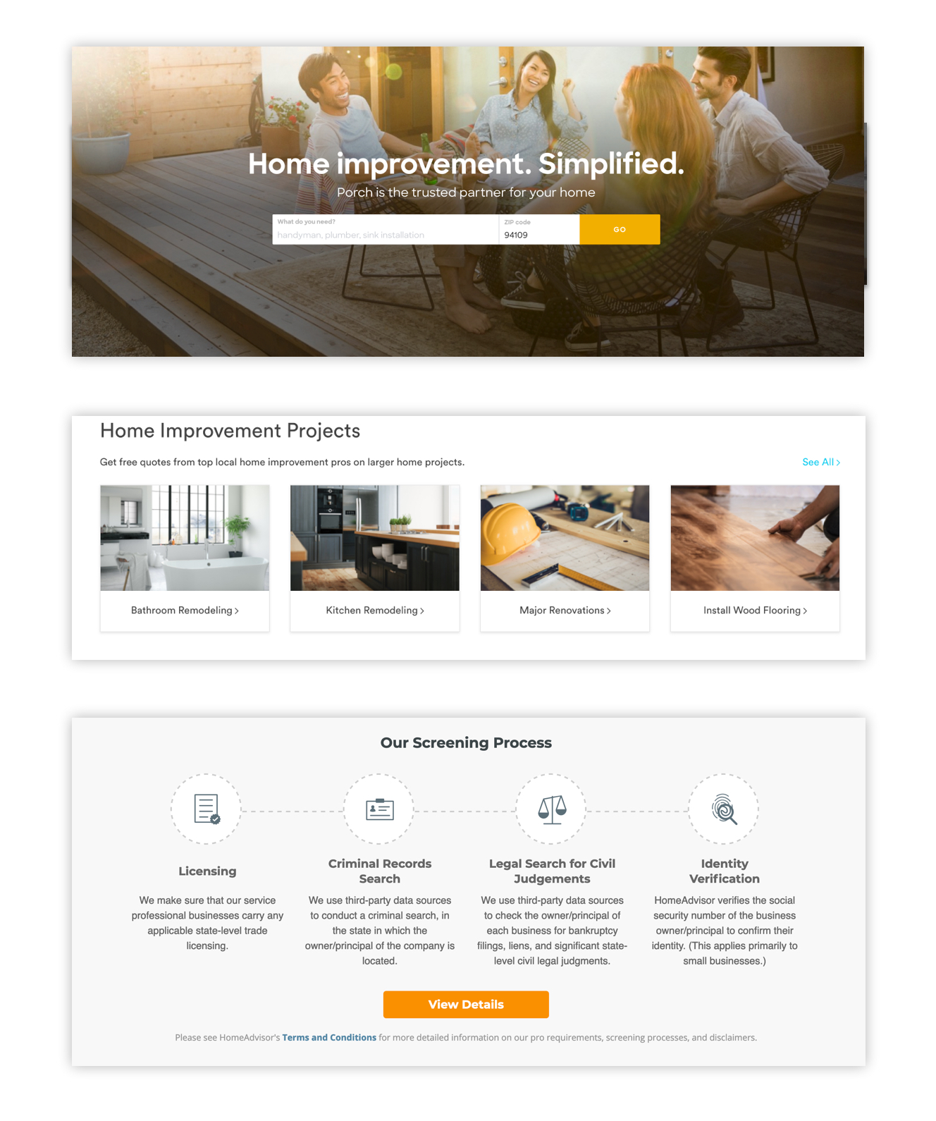
12 homeowners who have hired a home service pro within the past 2 years were asked to explore 4 competitors’ homepages: Home Advisor, Angie’s List, Porch, and Handy. They were given various tasks and provided attitudinal and behavioral feedback.
Here’s what we learned:
- Adopt: A large hero image, an emphasized search bar and a browse experience. Create an emotional connection with our users, be recognizable/familiar, appear fresh/modern and provide an intuitive experience.
- Avoid: Imagery that looks dated, staged or inauthentic. Don’t include aggressive/interrupting overlays. A homepage shouldn’t be long, it’s not the place to convey company value props (that’s addressed at the service page level).
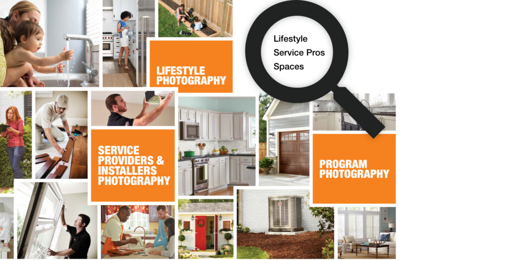
Analyze the Latest Brand Guidelines
The Home Depot – Home Services’ mission is to serve homeowners by ensuring their online experience is as easy and seamless as possible. Our brand guidelines gave us the option to use photography that depicts: Lifestyle (homeowners enjoying their homes), Service Professionals and/or Aspirational Spaces. Our aim was to discover which of these imagery categories best resonated with our users and use that style image as the hero.
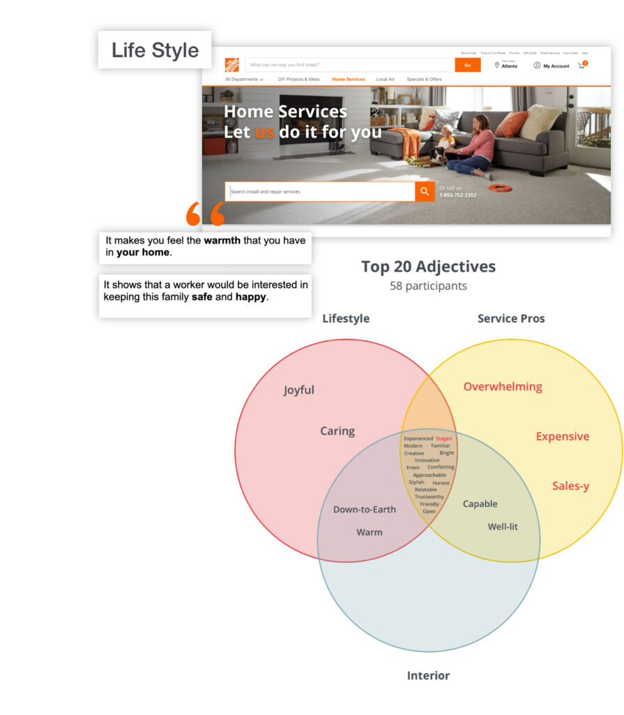
Hero Desirability Test
150 homeowners representing our key demographic (sourced through Options4Good), were shown 1 of 3 hero images depicting: Lifestyle, Service Pros or Aspirational Interiors on the SurveyMonkey platform. They were asked to choose 5 descriptors from a curated list of positive, neutral and negative adjectives. This type of test is called, Microsoft Controlled Vocabulary. The winner was ‘Lifestyle’ which received the most positive adjectives and the least negative. Evidence showed that this image was preferred by users and it coincidentally aligned closest with our brand guidelines.
Users described the Lifestyle image as:
- Joyful
- Caring
- Down to Earth
- Warm
- Familiar
- Trustworthy
We moved forward with a ‘Lifestyle’ hero image (seen here).
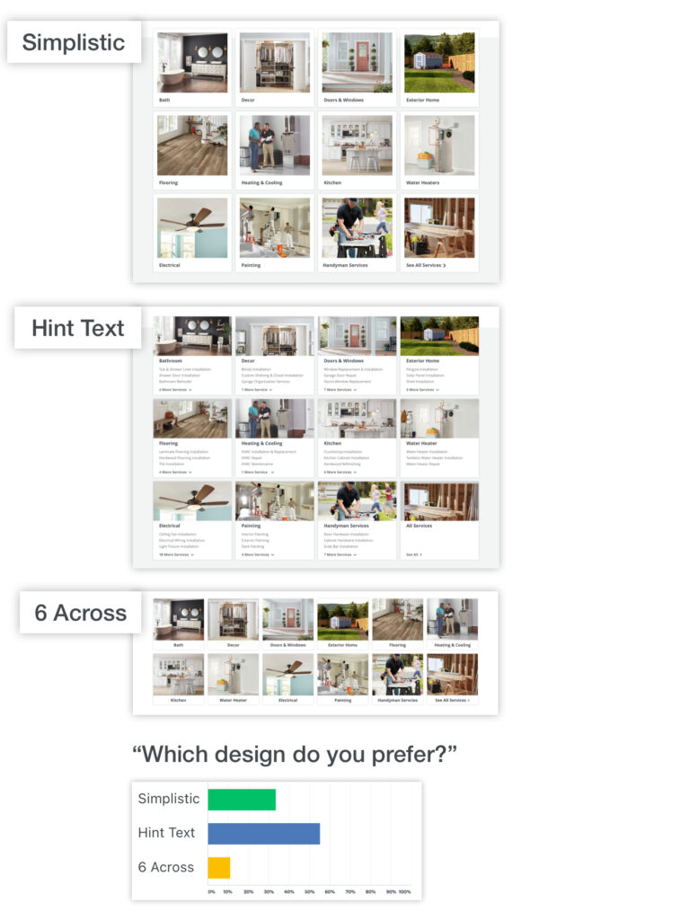
Tile Browseability Test
The second part of the user test took the same 150 homeowners to the Optimal Workshop platform. They were shown 1 of 3 tile designs: Simplistic, Hint Text or 6 Across. The test contained 36 timed clicked questions. For instance, “You want to have carpet installed in a bedroom, which category would you click?” We were measuring speed and accuracy. Lastly, we directly asked for their tile design preference.
Here’s what we learned:
- Each design has its strengths:
- Simplistic — Ideal when taxonomy is clear. Users were fastest on this tile design.
- Hint Text — Ideal when taxonomy is in question.
- 6 Across — Ideal when taxonomy is clear. Users were the most accurate on this design.
- When directly asked for their preference, by far users chose ‘Hint Text’.
We moved forward with the ‘Hint Text’ tile design.
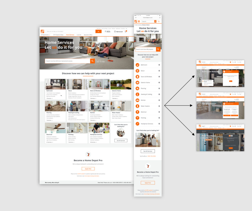
FINAL MVP DESIGN
Once our research was completed, I finalized the hi-fi responsive designs and conducted a validation user test to ensure we met our goals. The evidence indicated that the designs were well received with our target audience. The designs were then presented to stakeholders, signed off on, handed off to engineering and released to production.
- Enhanced search functionality
- Expanded the layout to full width
- Migrate from Django to Contentful
- Better alignment with the latest brand guidelines
- Content that supports Home Services & Pro Referral (seperate businesses owned by The Home Depot).
On