Consumer Facing Email Template Design
Visual Designer
Project Goals
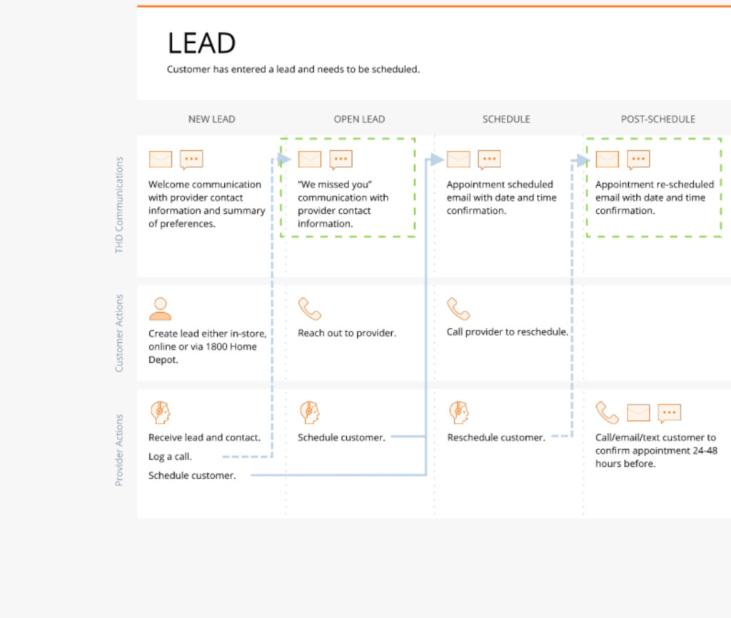
- Communications, Content, Design and Research worked together to reexamine all of the Home Service appointment processes and outlined each communication touch point.
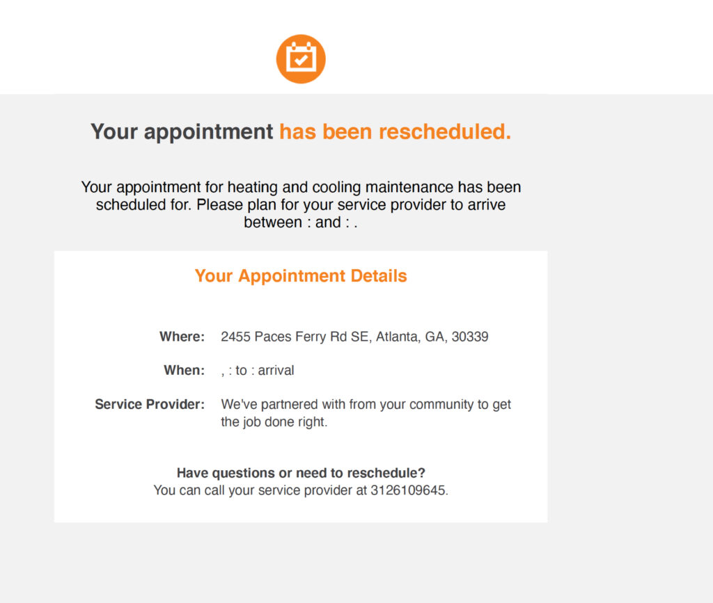
- Updated existing customer facing Home Service appointment email and text message communications to set more accurate expectations.
- Rewrote content to ensure the appointment date, time and process were easily understood by homeowners.
- Created a new email template design that better aligned with the most recent style guide.
- Fixed broken PDF links by linking to newly created ‘Cost’ and ‘What to Expect’ landing pages.
Cross-functional teammates include: Communication Manager: Stephanie Jarecki, Copywriter: Courtney Lieberman, User Research: Adam Engstrom.
Process:
Discovery & Framing
Outline Customer Journey
The Communications Team worked closing with Merchants (service owners) and service providers to gain a better understanding of the customer journey. The communication touch points were outlined.
Analysis of Existing Communication
All of the email and text message communications were analyzed: the information that was no longer accurate was addressed, the updated appointment processes were included and missing information was added.
Content Writing
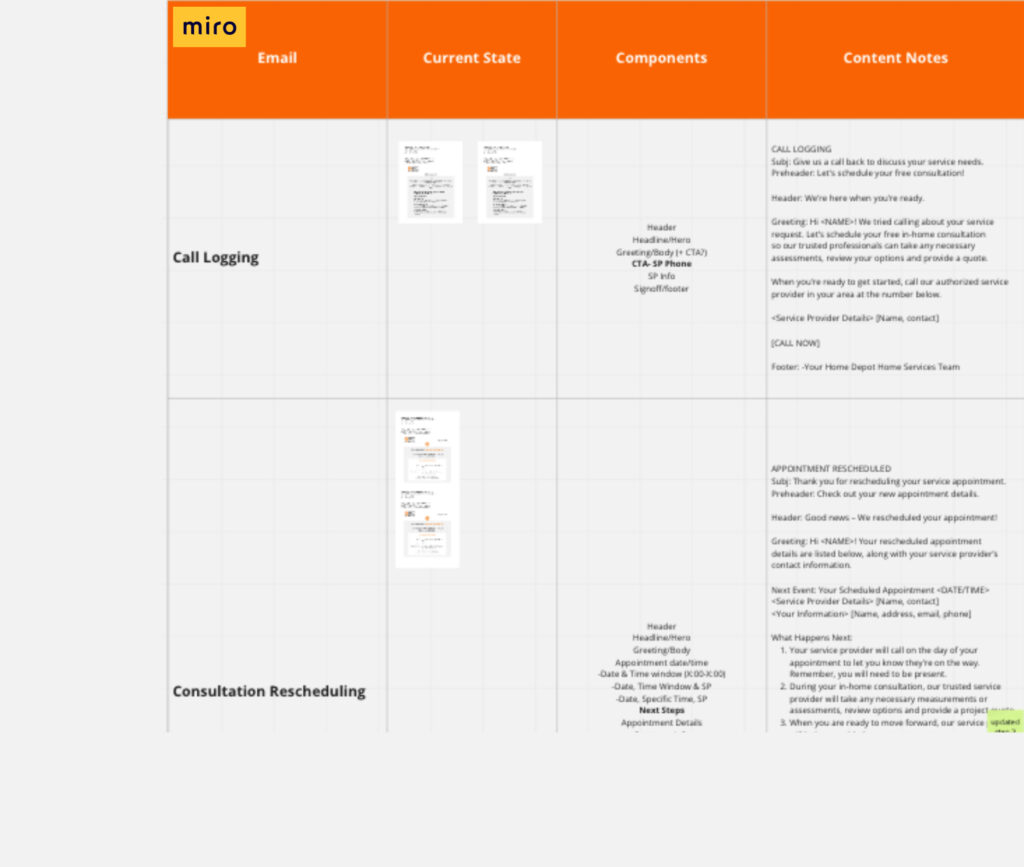
Our highly skilled copywriter synthesized all of the discovery documentations and wrote copy for the our first core program. The first round of emails addressed the following scenarios: Lead Confirmation, Missed Call, Follow Up, Appointment Confirmation, Reschedule Confirmation, What to Expect, Please Pay Balance, Thank You for Your Purchase and Project Completed. We used Miro as our shared work space.
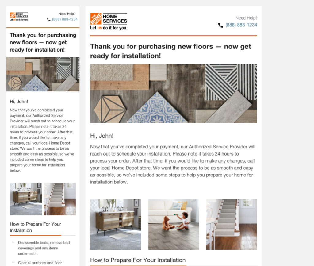
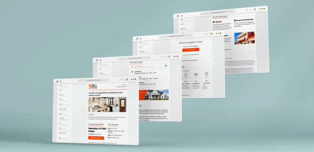
Visual Design
I reached out to other UX Design departments within the organization to discover if there was a recently developed email template currently in place because it’s important to maintain consistency across a brand. I received a new email shell, a Sketch file, from a dotcom team that contained a desktop and mobile layout with only a header and footer. I used this file and following the Home Services’ design system, created 3 new visual designs. I presented these template options to the team and we landed on one. From there, I sourced iconography and imagery from our internal DAM and designed modules for each content block. Once I had a design created for each email, I placed the mockups in Miro. In our weekly touch-base, I presented the designs to the team, received feedback and iterated. Then I handed off working prototypes to our User Researcher.
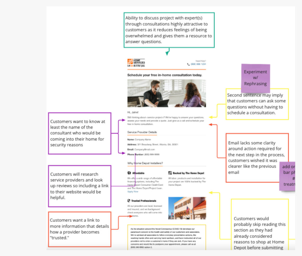
User Testing
Our Senior UX User Researcher conducted a qualitative user test consisting of homeowners who are currently in the market for the same home services as indicated in the email. Participants were given a scenario and asked to naturally review each email, talking through their thought process. The UXR created a report identifying pain points, opportunities, wins and neutral findings. He presented the research to our team. The results were placed on the project’s Miro Board, we discussed, synthesised and reflected on the findings. The copywriter then made updates to the copy and handed off to me (design) for iteration. I implemented the copy updates and user feedback into the mockups.
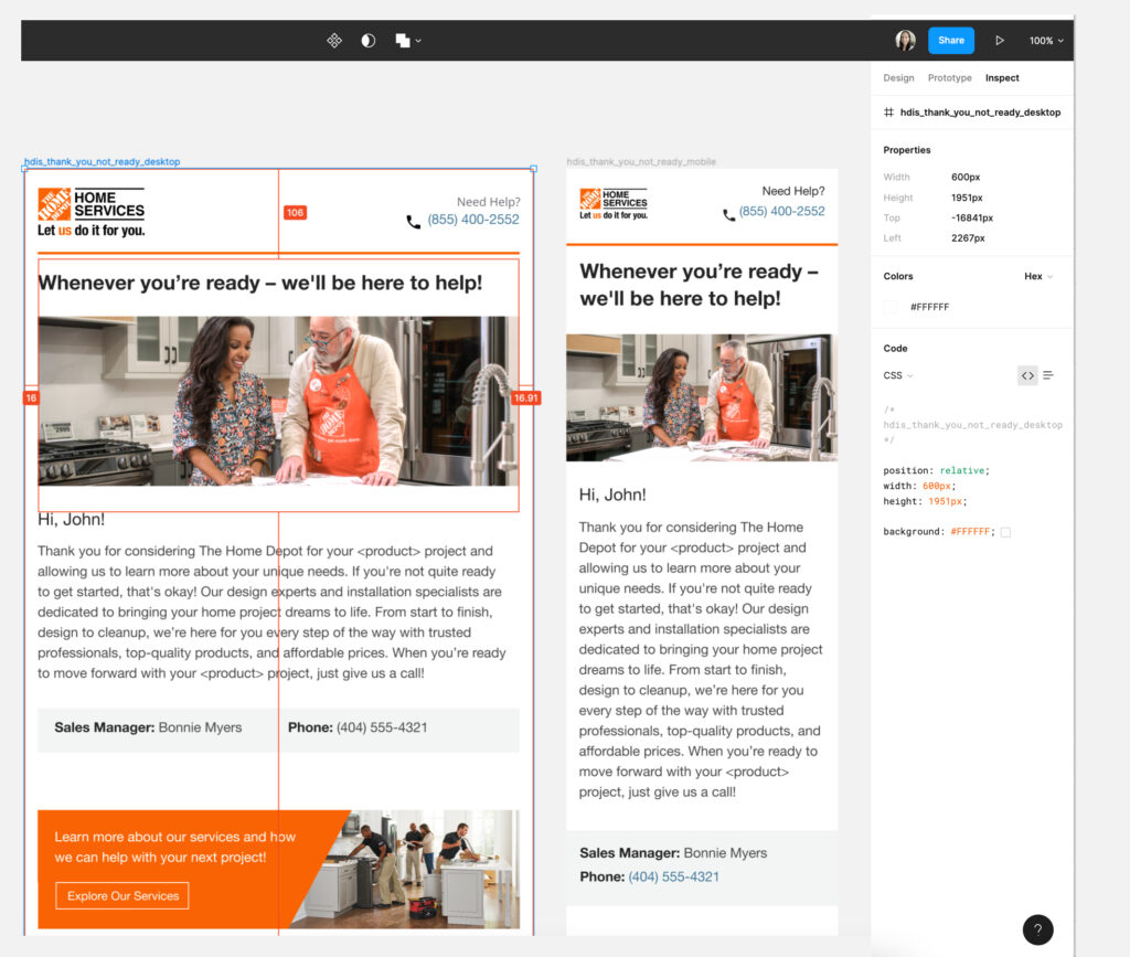
Design Handoff
I delivered a Figma link to engineering, along with a zip folder of all of the mocks and assets to add to the JIRA story. Once the emails were completed and went through the Engineering QA process, I conducted a Design QA to ensure the aesthetic was as intended. Once the team signed off, the emails were released.
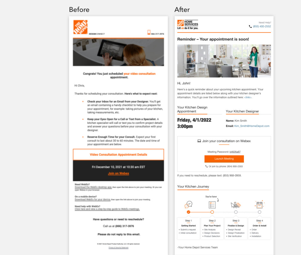
Before & After
- Communications are triggered automatically based on specialist and designer interactions with Salesforce scheduling interface
- Email visual design adheres to brand standards
- Emails provide contextual appointment details, next steps and how to prepare for their appointments
- Email content underwent user testing prior to release – more enhancements to come based on feedback